
It turns out that simple concepts like these aren’t so simple to execute. While the complexities of MODEL’s development has been dizzyingly fast-moving, Mustard have been steadfast supporters along the way.
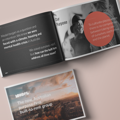
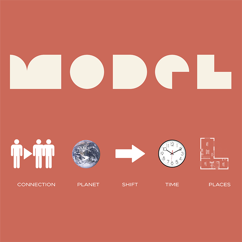
First, we crafted the name ‘MODEL’ as the simple and literal interpretation of their breakthrough ‘model’.
Along with a new name, came a new way of communicating. A clear and ambitious tone of voice was formed to not only educate people on MODEL’s vision, but also inspire them to support it.
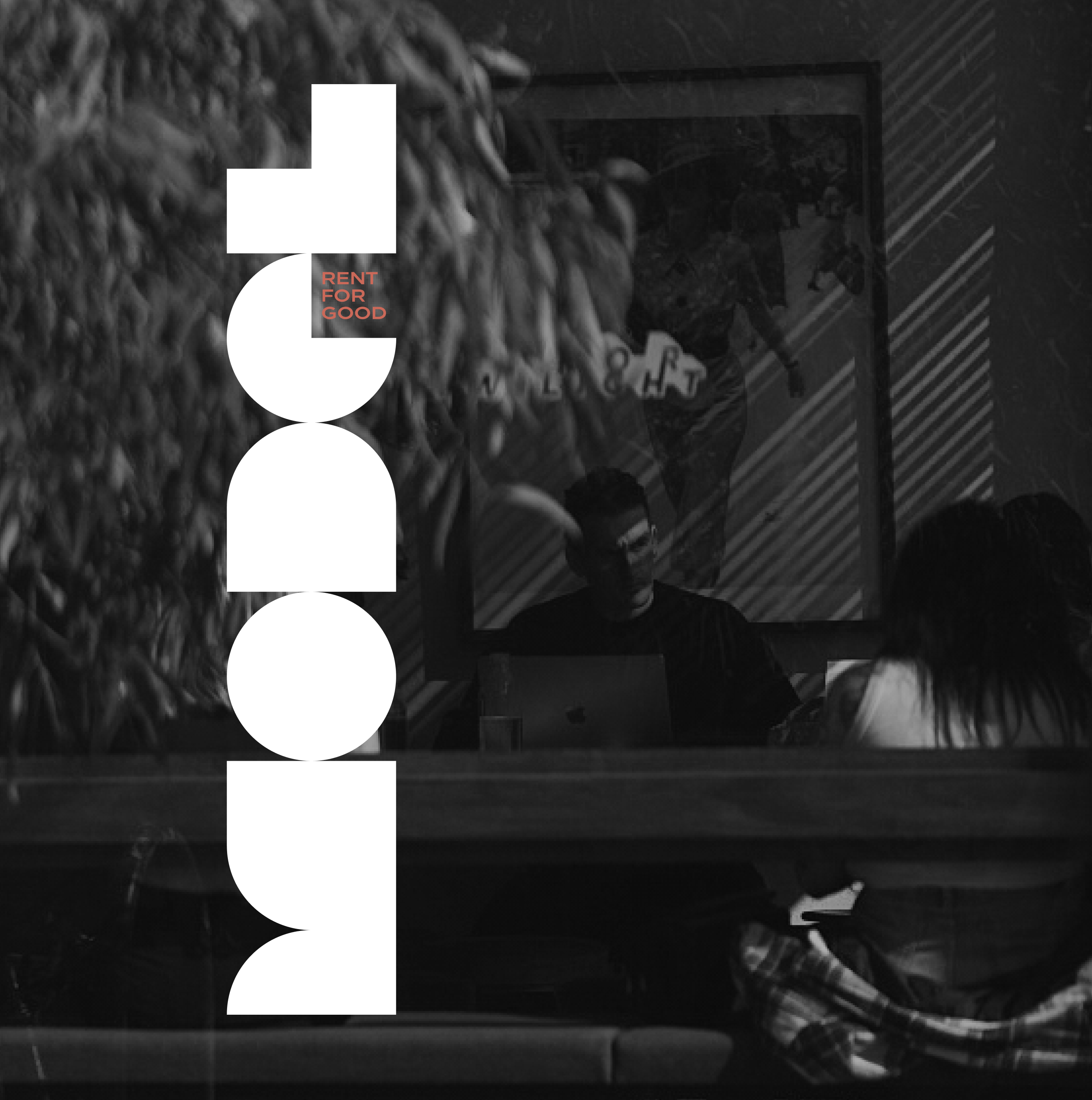
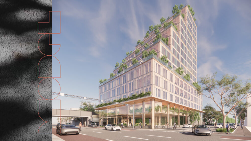
Our logo for MODEL intentionally allows space for the imagination of the viewer. By using an extra bold typeface with filled counters, the design abstracts traditional letterforms, creating a blocky, structural aesthetic that subtly represents the built form.
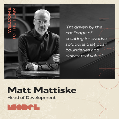
A collection of candid and figurative photographs set the visual story for MODEL, depicting a warm and relatable environment in which renters could see themselves being a part of.
Drawing from the logo’s gentle curved form, a set of patterns and shapes built out the brand elements and toolkit, lending a refreshingly organic quality to the brand’s collateral.
This pioneering achievement has caught the attention of The Age, The Australian, Financial Review, Architecture & Design, among others. Soon, a new standard in rental living will be set, paving a path for others to follow.